Obsessions are usually not a very good thing, then again I don't agree that graphics aren’t important. Zelda Skyward Sword is, of course, on my December presents listing. Zelda is always welcome, especially with Christmas. But I can't deny that the outdated Wii graphics are becoming a royal pain in the ass. Nintendo games have never been photorealistic highlights, nor they should. But the first 3D Zelda Occarina of Time looked awesome nevertheless. A day & night cycle, (pre-rendered) photo-like backgrounds, fresh water, an open world. It was the perfect transition between the 2D and 3D era. ~5 yeras later, the Gamecube Zelda Windwaker title looked like a quality Walt Disney cartoon. Not photorealism, but still a visual treat, even between the advancing tech used in contemporaries such as Halflife2 or F.E.A.R. And then the Twilight Princess arrived end 2006... The bright blooming tried to mask the Wii hardware that was dated already before it came out. For me, the result was a dark, grainy, empty, dead world. Zelda isn't about graphics, but while others in the series sucked me in by showing a magical, sometimes weird, but yet cozy "check-me-out!" world, the grim TP world felt cold.
And now the turn goes to Zelda Skyward Sword. Didn’t play it yet, but I must say it looks more colorful, and therefore more atmospheric & interesting to me. But still... those jagged non-anti-aliased edges are like razorblades in the eyes. The characters + facial expressions look like 1999 fruit with a face painted on it. And the lack of lighting compensated by lot’s of bright weird colored textures, looks as if your mom washed your underpants together with a whole rainbow. Sometimes tasteful, other times chaotic and messy. Yes, graphics do count, because immersion counts. Well, let's just hope Skyward Sword does what Zelda does best: delivering puzzles, a fantastic world, and an unique experiences. Although it’s going to be difficult to please this old nitpicker who played the same formula since the SNES already :p
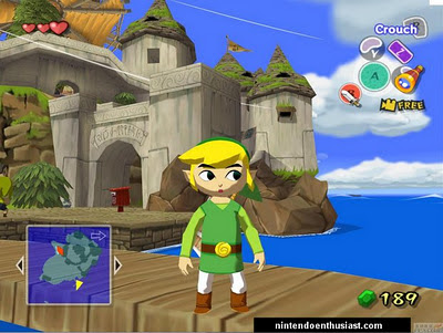
Zelda: Windwakerl; not a technical highlight, but a piece of art nevertheless.
More important in our case, how could T22 be scary if it looks like pixel-blubber? The scary moments will turn out in disappointing anti-climaxes if the enemy turns out to be a Doom2 sprite, or a pile of boxes? Now Silent Hill looks like foggy shit as well, but least it's a consistent whole of foggy shit. Keep in mind that graphics is not only about awesome shaders, realtime lighting, big Hollywood blasts or photo-realistic water. From a programmer perspective, I'm inclined to say a proper graphical engine makes the graphics hot-or-not. But how come that games like Resident Evil 4 (Gamecube / PS2) still looks good even without tons of effects? And how come that custom made maps in UDK, Source or CryEngine often don't look good at all? Exactly, don't underestimate the power of art(ists). The better they master their(your) tools and engine-tricks, the better results they can make. Even with a limited technical toolkit eventually.
When looking at our Radar Station that is going to be used for the next tech-demo, I'm not 100% happy with it. Of course, when seeing the same stuff over and over again for the past 10 weeks, you become tired of your own creations. And as a programmer, my focus goes to the graphical bugs and shortcomings instead of the good parts. Normals inverted. Texture missing. Lamp looks like poop. Parallax effect not good enough, bleh. While a normal viewer may not even notice it. But also a non-technical person can probably tell the screenshots are not quite yet “A++ quality”.
Outsiders, but also meself are often making the same "mistake". And if you're a hobby game/graphics-programmer, you're probably guilty too. The mistake of comparing your (unfinished) results with commercial games you just played, or (Photoshopped) screenshots from super-engines. It's good to put high standards, but give yourself a break! 4 hours in the evening versus 50 hours-in-a-week work times. Two-and-a-half artist versus the 101th Airborne 3D-nerd battalion. A null euro budget versus a X(-hundred)-million euro budget. Even if you master the code, you still lack manpower to create comparable results. Unless you’re blessed with plenty of talented volunteers to help you out of course :)
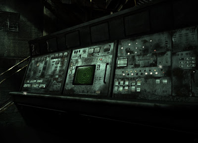
A brilliant engine still doesn't make good looking 14k meshes + textures for you... Sergi spend quiet some time on his newest invention shown above!
I'm writing about this (again) because I was looking at some details while playing the PS3 Uncharted 2 demo. And at the same time I was figuring how to improve the Radar Station in these last weeks. Maybe check some enhanced parallax shaders, add some more secondary detail textures on the concrete maybe... I'd say our Radar Station looks pretty good, but something is missing... Then when looking at Uncharted 2, I noticed the individual textures, objects or shading-tricks (such as reflections or shadows) weren't that spectacular either. Nope. What really makes their environments look alive and realistic, is the high amount of "stuff" stuffed into it. In our case a balcony is typically made out of a few 3D cubes, 2 concrete textures, and maybe a drainage pipe in a corner. In uncharted, there is small crap on the floor, a broken cable hangs on the walls, pots are stacked up, a bit of water dripping in the corner, leafs and foliage growing over the walls, a pile of rubble in another corner, 6 different textures.... And that's just a simple stupid balcony, a lot more detail can be found in the surrounding background.
Not just quality, also quantity matters. Do you know why the 3D office-room in your game doesn't look very realistic? Because it's empty. In your face! Let me guess... carpet tiles on the floor, a white plastered texture for the walls, system ceiling with (only) 1 lamp, a few (cloned) desks with a computer screen and keyboard on top, some chairs, and a few posters on the walls. Oh, and for the detail-connoisseur: a stapler on one the desks! Probably that stapler looks a bit out of place, because it's the only small object in the scene compared to the desks and computers. Now look around you in the real world. In my little office at work, there is more garbage than one can count. Computer here, computer there. Cables, lot's of. Electrical outlets, 6 lamps in the ceiling to lit the small room, airco unit, papers scattered everywhere, plastic coffee cups, garbage bin filled with stinky banana peels, oil-marks on the carpet, little holes and damage on the wall, some unnecessary chairs in a corner, a backpack below the desk, cardboard boxes with more electrical junk, folders, VHS Videos(hu?), circuit boards, tape, screwdrivers, business cards, elastics, plastic crap, pencils, markers, and so on. And I'm still missing a damn stapler by the way.
Even simple scenes carry more detail than you would see at first. Just take a look in a random hallway. Wood-floor, painted wall, stone ceiling... That's only 3 boring textures. But look again and better this time. You’ll notice radiators, cables, wires, unused sockets, cracks, marks, skirting, holes, repaired spots, garbage, and the list goes on and on. 6 years ago we could argument that computers can't handle such large amounts of useless junk to render, but these days it shouldn't be too much of a problem to scatter pens and papers over a desk, or to throw bricks and dogturds over the 3D streets. No excuses!
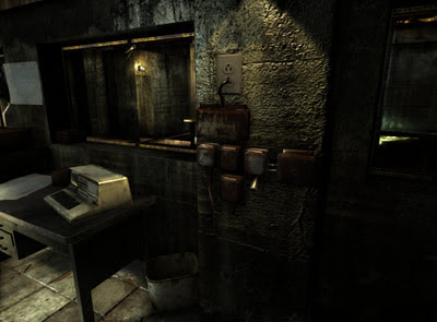
Here one of my major issues. The rooms are pretty large, and thus the textures need to be stretched out further as well to prevent repeating. But small stuff like these sockets suddenly look too detailed compared to the wall. Putting a slim, pretty woman next to a fat woman makes the fat one look even fatter. The solution? Increase shadowMap resolution, add decals(cracks, holes, paint, damage, ...) on the walls to make them look more detailed, add (a lot) more small stuff nearby. Or even better, less texture stretching & more variants on the texture to compensate the repeating. In other words: more assets > more production > more artists
The real limitation is, of course, the lack of manpower. Currently I have three guys on the assets (in their free time). Julio makes surface & effect textures, Sergi makes objects(and their textures), and Robert is doing a little surprise for the tech-demo. Talking about surprising, Robert just became a father btw! A little, healthy little boy surprise entered our world last Sunday!
Anyway, I can't expect three men to fabricate whole asset-libraries in a short amount of time of course. So, for now the environments are still a bit empty, and small details such as a pipe or outlets look a bit out of place. Too bad, but there isn't much we can about that now, no matter what shaders you can bake. Now you understand why games have such big budgets these days. The stapler-models alone already requires a production team of 8 artists!
No, but seriously, the men separate from the boys by having well-thought, well-designed, well-filled environments. We should start with research and a huge photo-resource. Then create ideas & concept-art to give direction to the modelers. Then a group of modelers and texture artists that can exactly produce what makes a room look like a room. And finally, an engine + tools that fulfills the artist needs. That's the theory... In practice I made a bunch of maps with my limited skills, and now the other guys try to fill it with some textures and objects ... Oops, that doesn't sound too hopeful for the next Demo :)
Nah, I'm sure it will look pretty good, certainly for a hobby project without a budget. We can be proud we did that all by ourselves in the evening hours. But one has to analyze and place critical notes once in a while, right? At least we have some ideas of how to improve the quality next time. And maybe I should spend some more energy on finding extra concept & 3D artists rather than trying to patch everything with new shaders :p
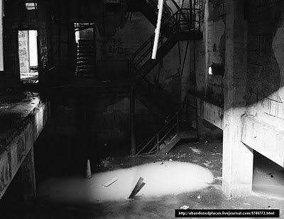
Before the wole modeling process begins, you got to start with the proper ideas. Bad or boring ideas can’t be fixed by shaders or good looking textures. The Radar Station was based on some cool photographs Julio found on
abandoned-places. Too bad we didn’t had time to sketch good maps first. I just started modeling relative big simple rooms connected with each other. Got to admit the Radar Station wasn’t meant for a movie in the first place btw!
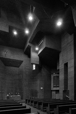
Here some more input a friend gave me after Googling around. Not-so-usual designs are important elements if you want to show something impressive. If Tower22 would only be made of corridors and apartments you see in any other flat, it would become boring very quickly...

No comments:
Post a Comment