Currently I’m finishing the cinematic/scripted events. That means tweaking the timing of triggers, putting the camera on the right positions, AND, gathering sound effects. After all, where is the thrill without any sound?
I don't have to tell you that movies and games need audio effects and music to create a dramatic scene. Horror and thriller movies can't do without an angry synthesizer while that clumsy stupid woman is exploring that dark house with a kitchen knife, in her night-dress of course. When talking about game-programming, you probably think about graphics, but having a groovy sound is at least that important. Hence, I dare to say it might be even more important for some game genres. Cool graphics still fall when your monster moans like a little girlie. Some shooters completely fail just because the weaponry sound like an air pellet rifle. And even without much visuals you can still create a bone chilling climax when using the right eerie, psychedelic sound. Yet, strange enough games are rarely praised for having supreme audio. Probably because it’s less of a technical challenge. However, composing the right tunes is far from easy.
I'm afraid I won't be able to ship this movie with all the proper sound effects I would like to have, simply because I can't produce them myself. I can draw some textures, do models or even make a few (stiff) animations, but audio is a black hole. Except that we made some house music by recording farts and pasting them in a bouncing beat with Fruity Loops. Years ago. But that is not really going to help I guess. Another options is to browse the Internet. You can find quite a lot when browsing the web for free sounds, or even buy complete CD's with SFX for a reasonable price:
- http://www.flashkit.com/soundfx/
- http://www.findsounds.com/
But this scenery is so specific and based on dreamy unreal situations that the default sets of M16 gunfire, yelling grandma (CrazyRingtones®), Ferrari engine, sweet puppy barking, baby burps, or jackhammer & sweaty construction worker is not the stuff I need. I'm not much of a sound composer, but the things I have in mind are... how to explain it?
The environment has to play mind-tricks with you, so crazy ambient loops are key ingredients. The environment is silent and desolate, yet you hear lots of unexplainable, weird things. As if the building "talks". Getting mad of all those voices and chaos in your head and stuff. As for the monsters, I like them to shut up for a change. No catchy phrases such as "GRRR!!!", "AARH!", "See you in Hell!" or "Die!". The monsters aren't really mad at you to start with, so they just chatter unintelligible gibberish. If they make any sound at all. Maybe the best comparison might be the Silent Hill series. At least, that's what I would love to see, uhm, hear. But so far I'm completely dependent on whatever sound I can find.
A little bit difficult to post sound screenshots. So you'll have to do it with this... kitchen.
So, my best chance was having a peek into the Doom3 sound library. Hundreds of horrific ambient samples such as metal bending, demon computers, buzzing lights, monster moans, smooshy fleshy jerky sounds, evil praying monks, and so on. Now Doom3 is a lot more noisy and satanic than I’m aiming for, but there certainly are some cool effects to find here. The entire game is stuffed with threatening ambient loops, crazy machinery and other hellish sound. So I had a look in their *.PAK file. I know that is stealing, but I'm just an innocent boy, only playing, fingers crossed. Let's hope I can find a good sound engineer one day. But then again, how the hell can I attract a qualified boy/girl with a dull soundless movie? Precisely. Forgive me John Carmack & co. By the way, it Was Doom2 15 years ago which got me thinking about making games in the first place, so don't blame me :)
All in all, that was quite a different ride. After gathering a collection of (creepy) sounds, I started to write a storyboard. A sound storyboard I mean. Close your eyes and imagine walking your way through those hallways, then paste the right ambient loops or “shock” effects… Not easy! It's not just grabbing whatever sounds cool, the whole composition has to align. You can't mix Coldplay with Rammstein and Jive Jones either (please God no). Where is Mozart when you need him?
Serving cold beer right here. Or maybe better not. The reason why I posted on monday is, as usual, because of some epic hangover last weekend. Burp, think I feel it coming again...-running to the sink- -clattering sound effects, with meatballs-
Talking about sound & games.... Don't you guys miss some kick ass quality soundtracks in (action) games? Most games these days are merely using vague ambient background loops. That would include what I have in mind. Quite different from the catchy Super Mario tunes, the heavy metal tracks in Quake2 (Sonic Mayhem) or Carmageddon (Fear Factory). Spacy house music in Conquest Earth (Eat Static) or . Quite a pity. What is the first thing when you think about such games? Exactly, the music. Often annoying, but some are really qualitative. In fact, I have quite a lot of game MP3's in my WinAmp list. My absolute favourite game music?
- Command & Conquor / Red Alert (Frank Klepacki)
- Castlevania IV (snes). Really, for a cheesy 1-bit sound card, it is awesome classical music
- Crusader No Remorse (techno-house-rock made on a Commodore by Andrew Sega)
- Almost forgot, Little Big Planet. Makes me as happy as a baby
How about yours?
Monday, October 25, 2010
Sunday, October 17, 2010
Another take on lightshafts
The original two-month planning for that movie was a little bit optimistic. But if you ever did some programming you’ll know that is a common mistake. Especially when working on something new. Someone asks how many weeks you need to create some shitty importer tool. “Weeks?! Minutes!”, you shout proudly. But before you know you wasted 24 hours already on some stupid pointer bug, or due the ever changing list of demands. Unforeseen sequences.
But I can pretty safely say now that the movie will be finished somewhere half November, and that even includes some margin. Unless... another pointer error will strangle me. Or recording with FRAPS becomes a pain in the ass (I'm kinda worried about the framerate, full-screen & sound). I won't have each and every point accomplished as I would like, but as a programmer you'll have to learn to make decisions and finish things, otherwise you'll stay in the early-alpha-development stage forever. There is always a bug, something that could have done better, or a new feature you would like to add last minute... such as improved fog & lightshafts…
I stumbled over this nVidia paper, and with my love for the graphical aspect of game programming, I couldn't resist. Improved volumetric light/fog is definitely one of the most important effects I'd like to realise soon. It can't hurt to have a quick peek right?
An older shot with a crunchy tobacco filter. The volumetric light here is just an additive cone. Still, this effect can dramatically improve your scenery. Don't mind the pink picture btw, that is the dynamic ambient lightmap (one of the things to replace in 2011)
For the info, volumetric light is the effect you typically see when light falls in a dusty room. You can't see light rays of course, but when the air is filled with tiny particles such as dust or smoke, the light will collide and scatter a little bit. Fog is basically the same effect, light collides with (local) clouds of condense. However, graphical applications do not have this effect by default, as lighting is usually calculated on the receiver surfaces (walls, floors, objects --> polygons), not tiny invisible particles floating in the air. We could fill the space with millions of little dots and apply lighting on them, but that would be tedious.
So far I considered two ways of doing volumetric lighting (except from simply modeling a lightshaft trapezoid with a dust shader into the scene). First there is the traditional pile-of-quads method. Wherever you expect lightshafts, you can create a "volume" of receiving geometry. Not tiny particles, but a (dense) stack of transparent quads that lit up where the lightrays intersect. By mapping the shadowmap of a lightsource onto those quads, you can get quite accurate results. However, the downside is that you need to put damn quads everywhere, which is especially nasty if the light can move around. Think about a day-night cycle where the sun shines into your building from many different angles. On top, having lots of transparent quads also takes its toll on the performance. Using less quads can fix that, but that would give jaggy results again.
Another method is a post effect, using blur streaks. This is what my engine currently uses.
1- Render a darkened variant of the scene. Only lightsource(flares) and the skybox are colored, the rest is black.
2- For each screen pixel, step over the screen towards the lightsource (2D) position. When passing bright pixels, add them to the result pixel (based on distance and strength settings). This creates streaks around bright the spots you rendered in step 1.
3- Blur the results to smoothen.
4- Render the result on top of the normal scene (additive blend).
This can give quite good results for a cheap price. But there is one serious drawback though, you'll have to see bright pixels (skybox or the lightsource), otherwise there is nothing to smear out either. It works for open area's, such as the skylight falling in through the treetops. But for hallway's with windows on your left or right side, it's not working unless you can actually look outside through the window.
Here's a third method. Not really new either, but maybe due hardware performance limitations not used that much yet. It's also a post-effect, that "only" requires a depth buffer of the scene (from the view perspective) and a shadow-depth map from one (or more) lights. I already had these ingredients so that shouldn't be a problem. Next step is to fire a ray into space for each screen pixel. You know how far it will travel thanks to the scene-depth buffer. Now take a (big)X amount of samples alongst the ray path towards the ray collision point. For each sample, check if it intersects a light volume. Or other types, such as local fog volumes. The more samples the ray hits, the more dense the shaft/fog or whatever kind of volumetric effect for that screen pixel.
Don't mind the crappy picture. At least I can understand it.
Intersections can be checked in a similar way as shadowMapping. For each raystep, calculate the world position and check if it can be “seen” by the light by comparing depth. Or check if the ray position is inside a fog volume. The theory is pretty simple, however, making this as a practical realtime effect is another story. I can't tell you all the implementation details, as I simply haven't coded it yet. Besides making a fast raycasting pixelshader (plus some additional shaders to blur and upscale from a smaller input buffer), I'm facing another problem here... Environment awareness.
Demo programs are usually fixed on a simple, small static location. But in a large complex environment, the settings can differ for each square meter. Some hallways are filled with dust while others are clean. One sector has slight orange fog while its neighbor needs thick blue smoky fog.
I was thinking about encoding “particle info” into a 3D texture, but unless you’re making dynamic cascaded textures like Crytek does for its new ambient technique, you’ll run into problems as well. 3D textures can’t be too big, and as you move in a big roaming world that texture needs to move with you as well. I think I have some easier / cheaper tricks to inform the shaders how to render shafts & fog, but I need some more time to work it out. How about… two months?
Finally some quality TV. In case you wondered what I did last week; the curtains somewhere in the background. Blurred out by much Depth of Field.
Monday, October 11, 2010
Art: The Curled-MonkeyPoo-in-metalfoil, symbolizing The great Misunderstanding
Although this is mainly a "technical" blog, it's also an attempt to get in touch with the creative side. No idea how, God works in mysterious ways, and so does the artist. Hopefully some concepts here can make us friends one day. But let's talk about some recent developments in the (Dutch) art scene.
As we all know, the Western World is currently living in a crisis. I always react a little bit giggly when hearing that word. Only one car instead of two, maybe forced to find a new job, no vacation in 2010, less steak & chocolate pudding... Crisis, don't make me laugh. For people that live in a pool of mud or somewhere in a thirsty war-torn desert, this is still pretty much a paradise I guess. At least here in the Netherlands.
But seriously, to prevent worse in the future, we'll need to take measures. No doubt about that, and the same goes for Holland. Finally, after having endless annoying discussions whether to have a ministry with our blonde (anti Islam)Wilders or not, there is finally a formation again. My personal opinion about this? Don't talk but work already dammÃt. If mister Wilders is really that evil, the cabinet will explode (or implode) soon anyway. We're not living in 1936 anymore. I think the way how Wilders leads his debates about Islam and failing integration is not really constructive indeed. Whether you are right or not, it takes charm and tact to convince. Not to convince his sympathizers (Henk & Ingrid as we like to call them), but to convince the Muslim. Then again, I'm not a fan of his opposition either. They accuse him of creating two division, but their continuous bash on Wilders (and all his voters), the comparisons with Hitler & 1930’s, and marking every piece of criticism as xenophobe or fascism is just as stupid as well. I think I'll just immigrate to Jupiter.
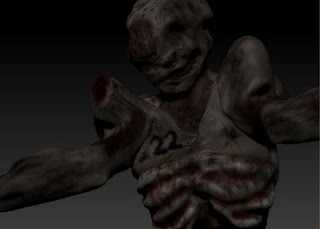
Off topic, my work for this week was animating this ugly guy. And to prevent breaking your legs when taking the stairs down. Due gravity & speed, the player would get launched off the stairs instead of nicely, carefully, taking the steps. Stupid physics.
Anyway, we'll have to scrimp. Crisis and stuff. Holland also has to deal with a large group of 65+ people that has to be taken care of by a far smaller younger generation; me & friends. You can spend each euro only once, so decisions have to be made. One of the departments that has to hit the brakes with this new cabinet, is the art & culture sector. I have no idea how much exactly, but currently quite some tax money is used to stimulate art so they are definitely going to feel the whip. As always, the reactions I read on the web are either 100% pro or 100% anti.
"Without culture we will be bombarded back to the dark age again, SHAME!!!"
versus
"Why the hell do we need a metal statue of a... pipe-horse-birdman-thing in our park anyway?!!"
Art. Or Artists. What can I say about them... I'm not talking about your nephew doing Flash animations, but dreadlocked hippies, having sex on a white canvas and (trying to) sell it for 7.500$ under the name "Les aventures d’Emanualle". Throw a bucket of blue crap on a wall and call it “green”. Make it controversial, make it weird, make it art. Make it in such a way that 9 out of 10 people doesn't (want to) understand it. So it keeps preserved for the "intellectual"… Is that a correct description of the artist? Please don’t get offended yet!
Wrong prejudices or not, fact is that most people don't understand art. And when looking at some artists, I'm not surprised that there is this image of lazy, weed-smoking anarchists, hiding their lack of talent/work-ethic by producing incomprehensible "art" once in a while. When not sleeping. When not too stoned. When not demonstrating against “The System”. Then again, I also know normal, hard working, down-to-earth artists. And although I'm not really familiar with the masterpieces or their creators, I can recognize and respect good art. Some of the greatest ideas just require some twisted, not so common mindsets. Often carried by, let's say unique creatures of God. If it takes a joint, dreadlocks, waking up at 11:30 and yellow striped pants, then so be it. The world would be boring if everyone looked and acted the same as me anyway.
The challenge with this particular animation was to keep the monster inside the hallway, not intersecting the walls too much. I'm reading a little bit about Inverse Kinematics right now, but that's future stuff.
So, economizing, good or not? The prejudices about lazy artists are certainly not always true. But that arises some questions. Does a talented person who works hard really need all that subsidy anyway? A good friend, studied at the art-academy, has his own business in logo design. Without getting a single tax penny. Same goes for his girlfriend. Another girlfriend is studying jewelry craftwork and plans her own little business. Again, without getting help, she pays everything herself (of course). And when looking at my own project, which is sort of an artistic -attempt- as well, is receiving jackshit either. I'm not saying my project actually is Art with a capital A, but honestly the same thing can be said about lot's of (subsidized) artwork as well.
I dare to say about 20% of the artwork is made by talented hands/minds, the remains are not that good or simply not art worthy. From desperate housewife art to haters of The System who completely lost it. The scope is wide but the artistic scene as a whole has to accept the fact that most people do not recognize Art in a piece of bended metal pipes (symbolizing the creators mind), a canvas with poop, or puppeteers doing a 48 hour jerk off session. Call us stupid or narrow-minded, but we are also your client. If Phillips or Sony comes with a brilliant new product, we still decides whether it sucks or not by buying or leaving it. We are afraid artists can't make a living anymore when the subsidy stops, but HEY, your local Mexican restaurant stops having an income as well if no one digs his shitty taco's. If 95% of the city residents does not like or understand the new "Love-with-a-twist-inBronze" monument statue, you can ask yourself why we should want such a project in the first place...
But before I'm making enemies with each and every artist, Hold on. Sony Blu-Ray players or taco’s are a different branch of product than art is. Of course most people won't understand art. Because most people don't know what it takes to create it, or how to look at it. From my own experience at school, mostly only 3 out of 25 children were creative. They spend their time drawing, the others went playing football and fighting each other on the schoolyard. No wonder the work of an artist is underestimated and often not appreciated. Struggling with the simple minds, getting flamed by (religious) people who got hurt once again, trying to explain the average Joe what you just made... That must be tiring.
Me personally, I don't think I should pay the household of lazy untalented artists. And when your community buys a new artwork again, then at least let the citizen decide a little bit as well before throwing another hundred thousand dollar for a piece of work that might not be seen/appreciated. But the problem is that this subsidy-reduction also blocks potential talent. People often forget what kind of influence art has in this world. The street view, architecture, music, logo’s, clothing, posters, cabaret, literature, opinion makers, critical questions or cartoons covering political dilemma’s... We also forget that becoming an artist requires a long bumpy way. Would the talent of jazz-band X ever be discovered if they didn't get a proper chance to deploy their selves? Would famous painter Z ever started seriously with this career if the chance of making a living with it is 0,01%? Artists require podia and exposure, a kick-start. Many probably won't come much further either, but some... As my unsubsidized friend said, the risk with stopping the money flow is that "being an artist" becomes something for the rich people who don't have to care about making an income in the first place. But above all, we shouldn’t want losing the creative part in our society.
If we have to economize, I'd say create some sort of probation. If your productivity equals ZERO, If you still don't sell paintings after X years, if your music still doesn’t come any further than the local pub, playing for 6 drunken truck drivers, a horse, and 14 year old groupie girls. Then maybe it's time for a reality check, and stop the investment. Sorry, but you just don't got it. Next. Life & business is hard, but that also counts for lady GaGa wannabes, Sony, the Mexican restaurant, and old mcDonald’s farm after having a bad year.
Other than that, I would like to advise artists not to rely on subsidy in the first place. If you can have it, good for you. If not, though luck, but why not using that creative right brainpart of yours to think about a solution instead of complaining? Like... having a normal job for 3 or 4 days in a week, and doing art as a side job? And then just look how it goes maybe? I would love to spend my 40 working hours on this project as well, but I'm afraid some people will get hungry then. It doesn't matter though. If you have REAL ambitions, your drive and heart is what counts in the end. Nothing can stop that, neither your wallet.
Sunday, October 3, 2010
Stitching Frankenstein
This week I had to use my creative "skills" instead of programming. Except for programming “chest/head rotation” instead of rotating the belly. When the player bends over (looking down with the mouse) it looked as if… he was ready to get jumped on, if you know what I mean. But worse, your head would also stick through a wall when bending over while standing close to it. Anyway, the monster model needed a few adjustments, and a skin. Most of the work wasn't drawing or sculpting though. Bringing the high-poly object back to a low poly object gave me a big fight once again.
Besides bringing down the polycount alone, I also had to fix the UV seams. For those who are unfamiliar with UV coordinates; to get that nice texture on your model, you'll have to make a flat 2D "unwrap" of it. Each polygon should have a place somewhere on the 2D canvas. In many cases without overlapping the space of other polygons. In practice that means each vertex gets a 2D "UV" or "texture" coordinate as well, besides its 3D position. These coordinates tell where the polygon pixels can be found on an image.
There are several methods for making such an unwrap, including doing it fully automatic. The trick it to optimally use the 2D canvas. The bigger the area the polygons spread, the more pixels it will use in the result rendering. Blabla, one of the difficulties with making unwraps are the seams. Imagine you want to texture a cylinder model. You can roll it out as a carpet over the 2D canvas, but somewhere you'll have to make a cut. The green line on the fantastic model below shows an example.
Two difficulties arise here. First, when drawing at the right side of the Cola texture, you'll have to make sure the left side of the texture connects well. If the right side is slightly more red for example, you'll see an ugly obvious color transition on the 3D model. Luckily this is automatically solved for you when painting in 3D. Programs like Sculptris or ZBrush have some really good tools that let you directly draw onto the 3D model. So you don’t have to care about where to draw on a 2D canvas. Afterwards you can do the fine detail stuff with a painting program. But, stay careful at nearby by the seams.
Another issue with seams are, well, the seams. A typical 3D mesh contains groups, (triangulated) polygons and vertices. Each group has a bunch of polygons, each polygon refers to (3) vertices, and finally there is the vertex itself which is usually a structure of 3D vector data: 3D position, 2D uv coordinate, 3D normal vector, and maybe some other stuff such as weights or tangents. Here lies a problem... If a vertex has only one UV coordinate... then how the hell can it be on 2 places at the same time (see picture)? Vertex #23 (just a number) is both on the left AND the right side. When importing this model, big chance the renderer will chose either 1 of them, causing a big texturing error. The boob docter doesn't stich the wound with white tissue either when operating a black woman.
With the new upcoming winter fashion for 2010, we got him a new skin.
The answer is to duplicate the vertices at the seam. Make a copy with exactly the same 3D data, except for the UV coordinate. Voila. But how are you going to do that on a high-poly model that has a half million vertices aye? Luckily I found this handy plugin for Lightwave that does this automatically for you:
www.mikegreen.name/ <-- check plugins, "Split by Seams", thank you Mike!
The only bad news was that it took the plugin for about 3 hours to fix the high-poly model. And then to find out you forgot something. Oops, just a moment. All in all, bringing the high-poly model to the engine was quite a ride:
1.- Model mega high-poly.
2.- Reduce to ~200.000 polys or something. I'll had to do this because my 32 bit machine would ran out of memory with some of the plugin operations on the mega model.
3.- Make an UV unwrap.
4.- Draw a skin on the 3D model. Generate a high-res texture (2048 x 2048 or something). You can always downscale that texture later on.
5.- Export the high poly model to something Lightwave can read.
--------- part deux -------------
6.- Import the high-poly model.
7.- Make a low-poly mesh (3.000 for example) with a plugin like these:
SimplifyMesh
DO NOT FIX THE SEAMS ALREADY! Or you will get gaps and holes at the seams in
the low-poly mesh.
8.- Fix the seams on the High AND the Low poly meshes with a tool like :
8.B- Wash your car, brush your teeth, do something nice with your family, and be patient.
9.- Generate a normalMap by looking at the high poly mesh with a plugin like Mike's UV seam fixer.
generateNormals
10.- Send the high-poly model to your grandma in a postcard, dump it.
11.- Now you have a textured low poly model, with a cool normalMap.
Hey, I'm not a really good modeler, but knowing your tools can bring you quite far!
Funny. After quickly putting this head together in about an hour, I didn't really know what to do with it... sick, or just trash? Then my girlfriend suddenly woke up around 02:00 and was shocked to death by my laptop screen. Haha, but she was really worried about the crap going on in my head, especially at that time. What better compliment can you get when trying to make something, boo, scary?
Subscribe to:
Posts (Atom)