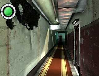
Another boring corridor. Yep, that's the downside of having a flat in mind. Corridors, stairways and apartments. That's pretty much it. Well that would suck of course, I have somewhat more ambitious plans with this flat. I'm hoping to give you a slight impression what that could be with the movie. Though I'm pretty much limited by my architectonic & modeling skills.
Nevertheless, dusty corridors are part of the job whether you like them or not. As simple as they seem, they are pretty hard to make them look nice. The shape doesn't really please the eye, and this particular hall doesn't even have windows. So you'll have to impress with other things. But what? Doorbells? Textures also repeat a lot here, and even doing lighting is difficult. Narrow spaces like hallways should have lot's of indirect bounces to spread the (ambient) light throughout the space, but as you may know, indirect lighting is damn difficult. The engine actually updates a lightmap for indirect light realtime, but its resolution is too low to have good results.

Corridor... boring. Need some lightshafts, better smoothing, more decals, junk on the floor. And probably a very different texture setup as well.
The answer is probably to add lot's of details, at the right places. Randomly throwing boxes won’t work either, the mess needs to make sense. Install switches, cables, pipes, fans, stuff like that. Paper and bubblegum on the floors, maybe a vacuum cleaner somewhere in the hall. If you need examples, iD Software are masters in making (eerie) corridor games like Doom3 or Quake4.
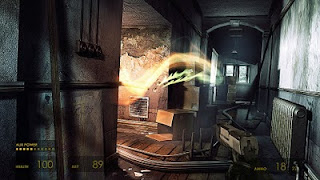
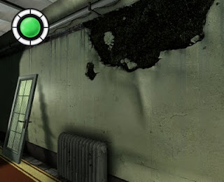
Another trick are decals. To break the repeating wall textures, paste dust, rust, blood, puke, poop, goop or cracks on top. Too bad my library doesn’t have much junk-objects and decals yet, so the hall looks awfully empty. But I played around with “torn-off plaster”, inspired by the picture below:

That's how every hallway should look like
Beautiful, isn't it? I mean the peeled wall. Ow, by the way, this screenshot is made by an artist that shows how Halflife2 *could* have looked with modern techniques. Well dammit, hurry on with that third expansion then. And start building Halflife3 already, I've seen enough Combine, Alyx and City17.
So that wall... There are 2 common tricks to achieve such an effect. A: Draw a flat texture/decal on top. B: Make an actual model of it. Option B is too difficult for me, and probably not worth all the polygons. Option A would work 5 years ago, but players are not stupid either. They'll notice it's flat. I'm not sure how the wall is made in this screenshot, but it doesn't look really flat, does it? Yet, if you check the wireframe from the same scene, you won't find curvy wallpaper polygons. Some sort of advanced decal with depth illusion then?
Whatever it is, my game will have quite many boring hallways, so I'd better think of something to make them somewhat more appealing. Regular decals look too flat, especially if they are relative big. So I came up with a somewhat more advanced decal shader, but still as flat as Will Smith's high-top-fade haircut in Prince of Bell Air. I think it's a little bit similar how F.E.A.R made it's bullet holes:
- 1 texture contains the "wall behind" part. Bricks or something. It includes an alpha channel to mask it. Transparent parts just pick the original background. Same like regular decals.
- 1 texture contains a normalMap. Not only for the brick part, also to override the surrounding wallpaper or plasterwork pixels to make it bumpy. That means different masking for the normalMap part of the decal. I'm using a deferred renderer, so overwriting pixel characteristics before the lighting happens goes pretty easy.
- For some additional depth, the normalMap contains height in it's channel for some slight parallax mapping.
- Shadows caused by the foreground are still drawn onto the brick layer. Not computed realtime. Keep them slim so you won't notice. You could however do self-shadowing with a more advanced parallax technique (marching through pixels).

It still sucks compared to the Halflife next-gen screenshot, but that’s probably due my drawing skills. Especially making that crumbled-paper normalMap. Stuff like this really requires an artist. As for the shader, maybe it can be done better with a more advanced parallax technique. I was thinking about making a displacement in the vertex-shader for a moment (like doing a terrain with a heightMap), but couldn’t figure out how to correctly pick the background pixels then. Next time Gadget, maybe.

I don't think it's about the fancy HD graphics or pixel/vertex shaders but rather the atmosphere. A flickering light here, the sound of metal scrapping [dripping water in the distance is always a good sound for eerie corridors] and some dust floating lazily in the light-shafts.
ReplyDeleteHey. Agree. Although bad shaders can make it worse, I believe it's a matter of using the available tools properly. I still find Resident Evil 4 (Gamecube) a good looking game for example, and that's not because of its realtime GI, sub surface scattering or parallax shaders. Which it hadn't. Just good textures, good mapping, and the effects applied on the right places.
ReplyDeleteThis corridor had to look pretty "normal" though. Can't always play around with fog, dark blueish lighting or other effects (which often hides the imperfect lighting or low geometry).
Dusty lightshafts is certainly something to add. Only problem is that they are quite demanding when using something like this:
http://developer.amd.com/media/gpu_assets/Mitchell_LightShafts.pdf