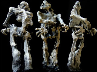
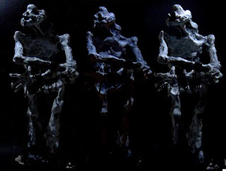
Claymodel and sketch were done by my www.pixelridder.nl friend. Kinda feel like claying now…
Instead of brute, strong, muscular, bloody, angry, mechanical, hellish monsters, we were more aiming for...[looking for a proper word on a Dutch-to-English translator]...malformed humanoids. You don't really know whether to be scared or feel sorry for it. Well, Tower 22 should have somewhat similar foes. And not just because they're cool. They actually fit in the storyline. And no, this is not a result of biological experiments by evil doctors. Although the first ideas for the project where these pictures came from were actually a little bit based on cold war + abandon lab. But I realized that has been done dozens of times before, so the story and environment have become radically different. It's hard to tell what this new story exactly is, because it's the type of game where you start off with knowing nothing until you finish the game. Many of the why's and how's may already spoil the clue. I'll have to carefully pick my words about that.
Either way, guys like this one share the building with you. And since you don't have a BFG9000 or full automatic M60's to clear the path, you'd better watch your back while mobbing the corridor floors... That should give a slight idea of what the game should feel like.
But enough about that, I was aiming for a little movie right? I wasted almost 2 weeks on those stupid curtains (cloth FX, see 2 posts earlier). In my little test-app, it worked great, but in the engine the curtains would deform to a polygon massacre. First the UV coordinates were wrong again due a shader compiler option I inserted 3 years ago. Later on the gravity was basically pulling harder than the spring constraints that keep the material together --> making an infinite stretch. Couldn't figure out why, until I realized the relative low framerate(30..60) was causing this.
You know, physics don't like low framerates, especially not when they are varying as well. So I could do two things: do 100 iterations(corrections) to get it right. Or fake a fast framerate. I chose the second option. Don't want to give up too much performance for a stupid piece of cotton. The end result isn't even that bad. Instead of ultrafine cotton that slips through your fingers, the curtain now moves more like an old dusty patch that has been peed by 200 cats over the years. That's what I call realism. Still, I’ll have to fix some bugs and make a system to hang those curtains / cloth into the world in an user-friendly manner. A "Granny's Attlier" panel in the editor.
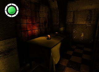
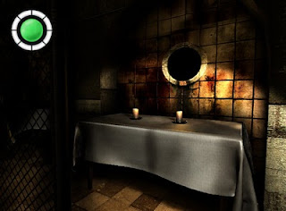
Got to fix the tablecloth shader. It's 100% cotton, but it looks more like a piece of rubber stolen from a SM dungeon somewhere...
But hey, what’s that? Thought cloth didn't work?! No, but LightWave does. What you’re looking at is a pre-baked model. For lazy (or bad) modelers like me, you can just create a subdivided plane and let it drop onto the table. Lightwave will do the whole simulation, and you’ll just lay back and watch. Once you're happy, save the result back into a model.
Lightwave Cloth Manual
Little youtube movie
Well that sounds easier than it was. I spend the whole weekend figuring out how it exactly worked, and adjusting parameters. Besides, the simulation runs f*cking slow. Hit the run button, wait 5 minutes, and then hopefully the tablecloth didn’t curl up or fall through the table. I doubt if my engine does it better, but deffinetly a lot faster.
Another problem was the polygon count. The tablecloth in the Lightwave simulation had about 100.000 polygons. That's a little bit too much for a (not-so-important) ingame object, don't you think? So I dug into some plugins to reduce the polygon count. And since I didn’t want to lose the small details from the high-poly tablecloth, I found another handy tool that generates normalMaps by looking at the differences between the high- and low detailed model.
Lightwave plugin to reduce polygon count (WITHOUT loosing UV coordinates!)
Lightwave plugin to generate a normalMap by comparing hi- and low-res model
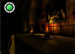
Holy shit, are those REAL animated sprites on those candles?! Bet ye are. They even distort and blur the background (a little bit too much). After all those many effects, a simple animated flame wasn’t supported by the available shaders yet.
The result is a not so spectacular table, but at least we learned some new tricks and got hands on some crucial tools if you’re into LOD or bumpmapping with Lightwave. Furthermore I programmed some “motors” to make things move this week, but let’s keep that for another time. Yet, there is still one last thing I’d like to report; if your Wii is gathering dust, do yourself a favor and check out Mario Galaxy 2. Yahoo! Our daughter must be wondering what’s wrong with daddy, happy as an eight-year old.

No comments:
Post a Comment