It still took some years before I could actually start programming though. No PC, no idea, and not the brains to solve formula’s other than 8 + ? = 12. And without internet or able to read English either, becoming a game programmer was “far future” stuff. Besides, playing games and drawing “levels” together with friends was much more fun than even thinking about reading a book. That’s what they call a boys dream. And usually boys dreams don’t come true.
Well, my boys dream didn’t come true either so far. I became a programmer, but not in a game studio. I finished zero games myself. And honestly, I wouldn’t probably even like to work in some studio, doing game “X”. Because I want to realize my own ideas, not just pooping some code to realize someone else’s dream. How different than 18 years ago.

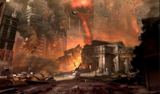
One of the few, if not the only, Doom4 "leaked" (concept)shots.... Well, after seeing complete cities getting destroyed dozens of times last 10 years, a shot like this doesn't produce much more than a "mehhh". Where are the cool mechanized demons?!
Forgotten glory
I’m not going to describe my whole boring programmer “career”, but I just came across this article (looking if there were some damn Doom4 screenshots already), about difficulties in the Doom 4 development process. 18 years ago I would have eaten blue mold cheese (and boy I hate cheese) to join id Software. But funny enough, I wouldn’t like to stand in their shoes right now! Even though name "Doom" equals gold, it seems to be impossible to make a fun game out of it once again. I'll explain.
Everyone older than 20 has likely played Doom (1 or 2). And younger generations have at least heard about it. Grandpa telling his grandchildren how Doom was the shit back in the nineties. The Nineties, where your mother wore gigantic earrings, where rappers had high-top fades, where the effects of Terminator 2 were mind boggling, and the flying car would come soon. Doom is still notorious, even though the last installment, Doom3 (2004), didn’t quite please everyone.
Maybe id Software just got old. But wait. How about those other old Bastards? Quake4 (2005), a follow up on Quake2 (1997), was cool but considered old and stiff. Games by then had open worlds, dramatic stories, Havoc physics, et cetera. Halflife 3 then? Eh…. Their development takes even longer than Tower22. Halflife2 was released in 2004. Some add-on episodes were released as well, but not a single f*cking screenshot from Halflife3. Hence, even their “Episode 3” didn’t appear (yet). And honestly I’m not even curious about it anymore. Enough City 17, Alix, Robot dog and Combine. They had their chance and didn’t show up anymore. Just give me a brand new bad-ass Halflife 3.
Duke Nukem then? Well, we know how that ended. “Shit happens.”, as the Duke would say. So, except from Halflife2, NONE of our old heroes managed to release a truly successful shooter-title in the last 15 years. It was either “fun but not revolutionary”, mediocre, plain shit, or it just didn’t finish at all.
We older guys have patience, and our warm memories will help forgiving faults, and makes us still looking forward to their next titles. The younger generations however may have seen the hypes, bought Duke Nukem Forever, and had to conclude those legendary super-games just sucked. It’s just as “cool” as your dad telling about how awesome The Beatles were back then… it’s a feeling and vibe you can’t bring over. You had to be there, back then. And time changes.
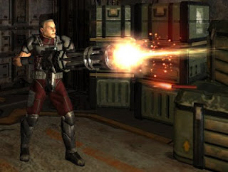
 Back then we had Big Fucking Guns son
Now what?
So, looking at the trend, my guess is that Doom4 won’t be much fun either, and those development problems aren’t a surprise. Maybe Halflife3 will do better, and that’s because its founded on a more modern (accepted) game design. As Halflife 1 was ahead as well back in the nineties, compared to other “dumb” shooters. The newer Quakes, Dooms or Dukes, are grand children of the “dumb shooter” genre though, and that’s exactly where the problem starts; Identity Crisis.
If I were in the shoes of id or 3D Realms, then what would I do? 18 years ago I wanted to make games like Doom, so, here is your chance. Tell us, genius, now what?
In forum user-reactions, I often read that games like Duke Nukem or a new Doom will fail (or failed) because they are based on simple, dumb, linear, mindless, corridor shooting. While modern games involve emotions, more thinking, deeper story characters, RPG elements, and whatsoever. Plus they also come in a different difficulty setting. While old games were a hard challenge testing your button-pressing skills, modern games focus more on pulling the player through an immersive story. It’s like comparing Heavy metal music with complicated stupid out-of-rhythm Dub Step tunes. It’s Arnold Schwarzenegger muscles versus Morgan Freeman storytelling. It’s wrecking cars versus solving Sudoku puzzles. Drinking beer versus drinking expensive wine. Modern games sure aren’t all good, but as you can see in their budgets, they take themselves very serious, and care a lot about immersion. At the same time, these huge budgets prevent designers from trying out new stuff. They copy from each other and play safe.
But I don't think those games fail because they are "old". I think they mixed up with modern (copied) elements in an inconsistent way, rather than trusting on their roots. Doom, Duke, or whatever old shooter, got stuck somewhere between the past and present. You simply can’t tell a dramatic story in a joking Duke Nukem setting, so let’s just limit it to saving chicks, like in the old days. But! Instead of carrying 12 weapons, we can only carry two now. Because hey… carrying 12 weapons isn’t very realistic, is it? The Doom3 guy still kept his mouth shut and mainly mowed down imps with a shotgun, but at the same time we could learn a dramatic story about what happened on Mars 5 billion years ago, and the overall horror setting was rather dark & serious, compared to the “crazy awkward weird hellish” atmosphere in the old Doom games.
A game that is only about shooting and destroying things, sounds old. So these games added some story, friendly NPC's, vehicle sequences and other "surprises". But even though I liked the Quake4 Mech parts (cause of the sound effects), such additions usually feel cheap and forced. You're not fooling us! So please, just focus on your core again!
Let's chew Bubblegum again
And that’s where it really went wrong, though very little forum-people seem to notice that. The “Core” elements weren’t done properly either! Don’t get me wrong, I liked Doom3 and Quake4, but they weren’t as addictive and fun as their ancestors. Multiply that argument with 10 for Duke Nukem Forever. I don’t necessarily believe that old-school-dumb-shooters wouldn’t be fun anymore. Hell, kids are playing ANGRY BIRDS these days! That isn’t exactly a revolutionary, dramatic, diverse, photorealistic, deep experience either. No, they just made a simple game. BUT THEY MADE IT SOLID.
And maybe it’s just me, but I still enjoy playing through old Doom (or Halflife, or Quake2, or Red Alert, or Super Mario, or …) now and then. Maybe it’s nostalgia fooling me, but recently I also played Advance Wars for the Nintendo DS. No complex stories, not very beautiful, annoying Japanese Anime kids as war CEO’s, but very, very enjoyable. And no I never played such a game in the past, so Nostalgia doesn’t count here.
The ingredients to create a so called “next-gen” game, don’t automatically equal a good game. In fact, I only like very few game, next-gen or not. In the end, a well chosen setting + addiction and fun are still the dominant factors. But those are quite often neglected, and masked with a lot of eye candy and other kinds of distraction. Making a game that is fun in the bare bone, just isn’t easy. It wasn’t in the Nineties, and now it still isn’t.
Eureka!
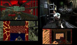
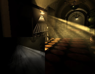
If that is all true, then in theory an old dumb game like Doom2 could still work out anno 2013. But they just have to do it properly! Ok. Then what exactly made Doom or Duke Nukem such good games back then, and what did they forget in their latest releases? Well, I can name a few things. But in one sentence: Realism took over, too much. If you played older games, then think back again for a second… weren’t those old level designs kinda weird? Levels these days are based on real-life structures. Even damaged sci-fi factories are still based on architecture that would make sense more or less. Compare this:

Even though Doom3 is more modern, its “scare factor” is based on more classical ideas. Darkness, cold lighting, damaged crap, blood stains, you name it. Doom2 on the other hand was a cacophony of purple skyboxes, green flames, walls of pink flesh and poison lakes. Combine that with metal rock music (instead of silent scary ambient mood sound), and the craziness is complete. Not just Doom, a lot of old games were a bizarre mixture of sounds, flying platforms and absolute illogical worlds. Actually Duke Nukem 3D was one of the first games with worlds that would come closer to real life situations. Cinema’s, sexshops, bars, flooded streets, space ships with lava… oh wait, there we go again.
Upcoming photorealistic graphics, has killed creativity and daring level design. Although the worlds look a hundred times better now, they all fall back on real life scenario’s. No matter it’s a sci-fi, medieval, cowboy or jungle shooter game. Looking good, but not very surprising really. Hehe, by the way, one of the user reactions I saw about graphics:
"
IDGAF that your new frostbite engine can render amazing
dust particles in sunlight. As a geek and someone who can't
wait for games to look great, yeah, it's amazing. As a player,
I ain't spending $60 to see digital dust.
I can go up to the attic and see it for free
"

Oops.
And yeah, even though I spend most T22 time on graphics, the quote is painfully true. So coming back to the question “what should I do for a new Doom or Duke Nukem?”… Well, make some bizarre, illogical, colorful, twisted worlds again for start. Think out of the box, and DON’T think about what you see outside in normal-life(tm). Think in 486 computer style, where we needed other tricks to surprise. Make something that you WON’T see when turning on the TV or walking on the streets. For a change, just make levels with random themes, again and don’t care about one big story line that logically connects all the worlds. “Level1: bloody compound”, “level2: Skull library”, “level3: Lava Gaybar”, et cetera. Surprise me.
Second, they should perfect the art of killing hordes again. 18 years ago I enjoyed quickly running and launching a rocket, blasting 6 zombie-dudes at once, and now I still do. Too bad that 99.9% of the games don’t allow that anymore. Except Valve’s “Left 4 Dead” where dozens of zombies run at you. And guess what, it’s one of the few games I regularly play. And I’m not the only one playing it, so they must be doing something good!
In Doom3, you didn’t fight hordes, but hidden dangerous monsters one by one mostly. Quake 4 pumped it up a bit, but was still quiet and slow paced compared to its ancestor. The makers of Duke Nukem Forever didn’t understand its own roots all. Shooting a three-barreled machine gun AND kicking the mighty boot at the same time at a monster shitting on the toilets was awesome. But now shooting at the few enemies, with a stiff old Duke, just felt like paving your backyard with heavy tiles.
Just give me lot’s of monsters in lot’s of surprising variations, high speed avoiding of projectiles, plenty of blood, and excellent sound effects that keep us satisfied each time the trigger is pulled. I know in the Doom3 days, making such hordes wasn’t possible due computing limitations, but that should have been solved by now. And otherwise just remove some triangles and bones from your models. In the end, fun sells, not graphics.
Well, I’ll dream on again.


